Introduction
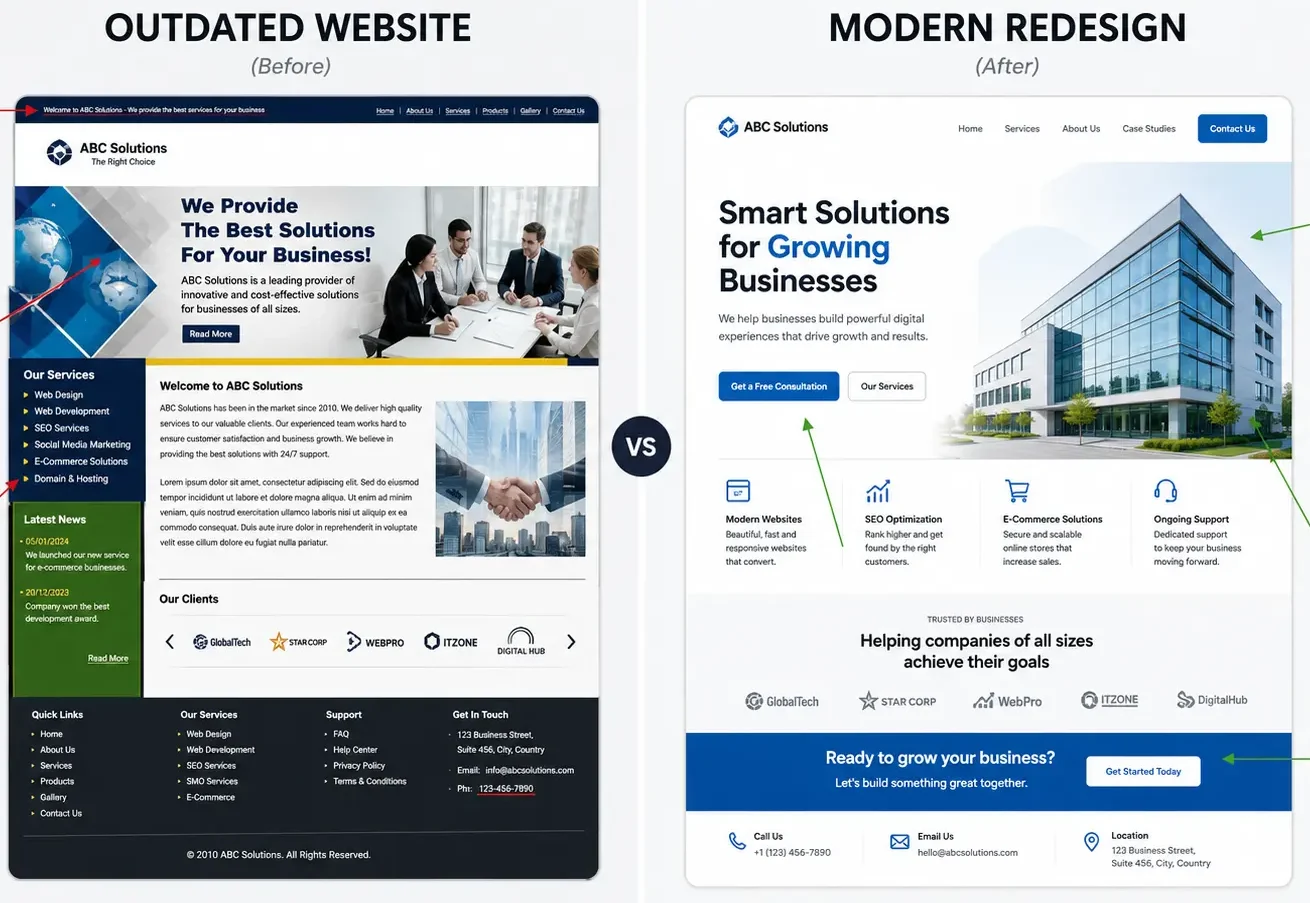
Most business owners don’t wake up one day and decide their website is broken. It happens slowly. A competitor’s site looks sharper. A prospective client mentions they “had trouble finding your pricing.” Someone on your team says the site looks “a bit dated” and everyone nods and moves on, because there’s always something more urgent to deal with.
That slow drift is exactly why so many businesses run outdated websites for years without noticing. Nothing dramatic breaks. The site still loads. The contact form still works. Google still sends some traffic. So the question never gets asked directly: is this website actually helping the business, or is it just sitting there?
This article is built to help you answer that question honestly. Not with vague opinions about design trends, but with specific, observable signs — the same ones we look for during website reviews with clients who come to us wondering if a redesign is worth it. By the end, you should be able to look at your own site and count how many of these apply. If it’s three or more, that’s usually a strong signal.
One thing before we start: a redesign is not always the answer. Sometimes a site needs a redesign. Sometimes it just needs a refresh. Sometimes the design is fine and the real problem is something else entirely, like a broken lead-capture process or content that doesn’t answer the questions visitors actually have. We’ll cover how to tell the difference, because recommending a full rebuild when a lighter fix would do the job is not good advice — it’s just an easier sale.
Table of Contents
- Why Businesses Delay Website Redesigns
- The Hidden Cost of an Outdated Website
- 7 Signs You Need a Website Redesign
- Website Refresh vs Website Redesign
- Website Redesign Checklist
- Common Website Redesign Mistakes
- Best Practices
- Frequently Asked Questions
- Conclusion
- Free Website Audit
Why Businesses Delay Website Redesigns
There’s a pattern we see constantly, and it’s worth naming because recognizing it in yourself is the first step to acting on it.
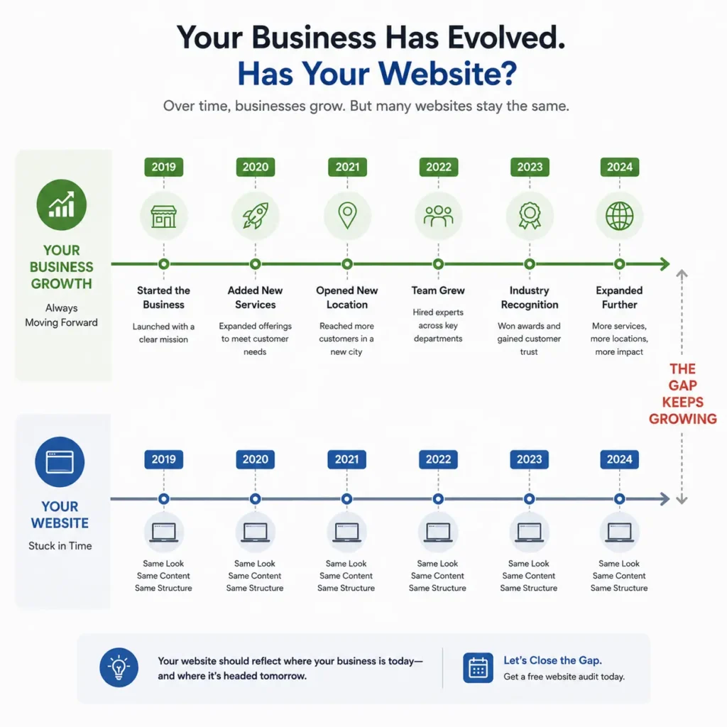
Your team built Your website at a point when the business looked different. Fewer services, maybe one location, a smaller team, a narrower story to tell. At the time, it did its job. Then the business grew, and Your website didn’t grow with it. The business added new services as a page bolted onto the existing structure. A new logo arrived and got dropped in without touching anything else. Over time, the site turned into something closer to a scrapbook of decisions made at different points in time than a single, coherent tool.
Nobody chose for this to happen. It’s just what happens when a website isn’t treated as a living part of the business.
The delay itself usually comes down to three things. First, cost — a redesign feels like a large, discretionary expense, especially when the current site “still works.” Second, uncertainty — most business owners aren’t web designers, so it’s hard to know whether the problems are cosmetic or structural, and harder still to know what a fix should cost or take. Third, and this is the one people rarely say out loud: fear of losing what little traffic or ranking the site already has.
That third one deserves a direct answer, because it stops a lot of redesigns that should happen. A properly planned redesign doesn’t have to hurt your rankings.Preserve your URLs, redirects, and valuable content, and Google can usually understand the changes. Google has clear guidance on site migrations.
Your rankings depend on content quality and technical setup, not on how your website looks.If you plan the migration correctly, you can usually preserve your rankings. The risk isn’t in redesigning. The risk is in redesigning carelessly.
So the delay continues. Meanwhile, the site keeps doing whatever it’s currently doing — which, for a lot of businesses, is quietly costing them more than a redesign ever would.
The Hidden Cost of an Outdated Website
Here’s an idea worth sitting with: a website doesn’t become outdated when it looks old. It becomes outdated when it stops helping people make decisions.
Design trends move fast, and it’s tempting to think “outdated” means rounded buttons instead of sharp corners, or a font that feels a few years behind. That’s not really the issue. Plenty of visually plain websites convert extremely well, and plenty of visually striking ones convert badly. What actually determines whether a website is doing its job is whether a visitor can quickly understand what you do, who it’s for, why they should trust you, and what to do next. When any of those breaks down, the site starts costing you money whether or not anyone in the business notices.
The cost shows up in a few specific places:
Lost Enquiries
The first is enquiries that never happen. A visitor lands on the site, can’t quickly figure out if you offer what they need, and leaves. They don’t email to ask. They don’t call to clarify. They just go to the next result on Google. This is invisible in your analytics — you’ll see the traffic, but you won’t see the enquiry that should have happened and didn’t.
Wasted Marketing Budget
The second is wasted ad spend. Before spending more on advertising, it’s worth making sure your professional web design services foundation is actually built to convert visitors into enquiries., you’re paying to bring people to a page that isn’t equipped to convert them. This is one of the more painful versions of the problem, because the cost is direct and recurring, and it compounds every month the site stays unfixed.
Damaged Credibility
The third is credibility. This one is harder to quantify but easy to observe. A dated, slow, or hard-to-navigate website creates a small but real doubt in a visitor’s mind about whether the business behind it is still active, still capable, still worth trusting with money. For professional service businesses especially — law firms, clinics, consultancies, agencies — It often functions as a stand-in for a first impression. People judge it the way they’d judge an outdated office or a business card with a fax number still on it.
Time Lost to Manual Work
The fourth is time. Teams that are constantly fielding the same questions by phone or email — questions Your website should be answering on its own — are spending hours every week doing manual work that a well-built site would handle automatically.
None of these costs show up as a line item. That’s exactly why they’re easy to ignore for years.
7 Signs You Need a Website Redesign
The signs below aren’t ranked by importance, because which one matters most depends on your business. But if you’re reading this because something feels off, this is the list to go through slowly, one at a time, against your actual site open in another tab.
Sign 1: Your website looks noticeably older than your competitors
This is the sign people notice first and trust least, because it feels subjective. It isn’t, entirely.
Visitors judge a website within seconds.
They haven’t even started reading yet.
Typography, spacing, images, and layout shape that first impression.
A useful exercise during a website review is to open your site next to three competitors’ sites, side by side, and just look — not read, look. If your site is the one that feels like it belongs to an earlier era of the internet, visitors are noticing that too, even if they couldn’t articulate why.
This sign matters more in some industries than others. A construction company can get away with a plainer, more utilitarian site than a boutique law firm or a design agency, because the buying decision relies less on aesthetic trust. But even in more functional industries, a site that looks meaningfully behind the market suggests the business itself might be behind too — and that’s rarely the message you want to send.
Sign 2: Your bounce rate is high and your time on site is low
This is one of the more reliable signs because it’s measurable rather than a judgment call. If you have Google Analytics set up, look at your landing pages and check how long people are staying and how many leave without interacting further.
A high bounce rate isn’t automatically bad — someone searching for your phone number and finding it immediately in a Google snippet might bounce and that’s fine, they got what they needed. Context matters. But a consistent pattern of visitors landing on a service page, staying for a few seconds, and leaving without scrolling or clicking anything is usually a sign the page isn’t communicating clearly, or isn’t loading fast enough for anyone to wait around.
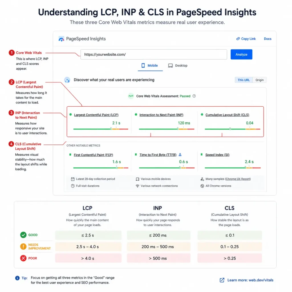
Page speed is worth checking directly here rather than guessing. Google’s PageSpeed Insights tool will show you how your site performs against Core Web Vitals — the metrics Google uses to judge loading speed, interactivity, and visual stability. A “good” result requires your largest content to load in under 2.5 seconds, your page to respond to interaction in under 200 milliseconds, and minimal unexpected layout shifting as the page loads. If your site is falling well outside those numbers, that alone can explain a high bounce rate, independent of how the site looks.
.
Sign 3: The site isn’t built mobile-first
A lot of older websites were built “responsive,” meaning they technically resize for a phone screen, without ever being designed with mobile as the primary experience. There’s a real difference between the two.
A responsive-but-not-mobile-first site often has small tap targets, text that requires zooming, forms that are painful to fill out on a touchscreen, and navigation menus that behave awkwardly on smaller screens. None of these show up if you only ever look at the site on a desktop monitor while building or reviewing it — which is exactly how most of these problems go unnoticed for years.
This matters because for the vast majority of small and local businesses, mobile traffic isn’t a secondary audience anymore, it’s the majority audience. Google itself indexes and ranks based primarily on the mobile version of your site, a practice it refers to as mobile-first indexing. If your mobile experience is worse than your desktop one, you’re not just frustrating visitors, you’re actively working against how your site gets evaluated for search.
The test here is simple and worth doing right now: pull up your own website on your phone, on your actual mobile data connection rather than office wifi, and try to complete the exact action you want a customer to take — book, call, request a quote. If it’s frustrating for you, and you already know the business, imagine a first-time visitor.
Sign 4: Updating content requires a developer
This sign is less visible to visitors and more damaging to the business behind the scenes. If adding a new service, updating pricing, publishing a blog post, or fixing a typo means emailing a developer and waiting days, It has become a bottleneck rather than a tool.
We see this constantly with businesses running older custom-built sites or platforms that were set up years ago without a proper content management system. The result is predictable: content goes stale, because updating it is a hassle rather than something the team can do in ten minutes. Old promotions stay live. New offerings don’t get added for months. Team pages list people who left the company two years ago.
A modern redesign, backed by professional web design services, should give your team complete control over updating pages, publishing content, and keeping information accurate without relying on a developer for every change., solves this permanently rather than solving it once. This is one of the areas where the case for a redesign is strongest, because the cost of the current setup compounds every single month it continues.
Sign 5: Your site doesn’t clearly guide visitors toward an action
Open your homepage right now and ask: if a stranger landed here with no context, would they know within five seconds what you do and what they should do next?
A shocking number of business websites fail this test, not because the business doesn’t know its own value, but because that value never got translated into the page. Instead there’s a broad headline about “excellence” or “quality service,” a stock photo of people shaking hands, and a navigation bar with six items, none of which is an obvious next step.
This is where the earlier point comes back: a website stops being outdated when it looks old and starts being outdated when it stops helping people make decisions. A homepage without a clear, singular call to action is asking visitors to do the work of figuring out what to do — and most won’t bother.
During website reviews, one pattern appears repeatedly: businesses with genuinely strong offerings and real expertise lose enquiries simply because the path from “interested” to “contacted” has too many optional turns instead of one obvious one.
Sign 6: Your website doesn’t reflect what the business actually does now
Businesses change faster than their websites. A company that started as a single service often adds two or three more within a few years. A local business expands to new areas. A consultancy shifts its focus from one industry to another as it finds its footing. Your website, built at an earlier point, quietly falls out of sync.
This creates a specific kind of damage: the site actively misrepresents the business to the exact audience it’s supposed to be attracting. Someone searching for a service you now offer might not even find you, because the page for it doesn’t exist. Someone who does land on the site might get a narrower or outdated picture of what you do than reality, and either leave or reach out with expectations that don’t match what you actually offer.
A common issue businesses overlook here is treating It as a one-time project rather than an evolving reflection of the business. The site was accurate the day it launched. Nobody scheduled a review for whether it was still accurate two or three years later.
Sign 7: Your competitors are outranking you with weaker content
This is the sign that tends to get someone’s attention fastest, because it’s uncomfortable in a very specific way: watching a competitor with objectively less experience or a smaller team consistently show up above you in search results.
Rankings depend on many factors. Technical site health is one of the most overlooked.. An older site with slow load times, poor mobile usability, thin or duplicated content, and weak internal structure gives Google fewer reasons to rank it well, regardless of how good the underlying business is. Meanwhile, a competitor with a modern, fast, well-structured site — even one with less genuine authority — often has an easier time earning and holding rankings, because the technical foundation isn’t working against them.
This is where professional web design services and SEO should work together rather than being treated as separate projects.. A beautiful new site with no attention to search fundamentals won’t fix a ranking problem on its own, and a technically sound but poorly designed site won’t convert the traffic it does earn. If this sign matches your situation, it’s usually worth having both conversations at once — which is part of why, at Saad Labs, redesign and SEO Services projects are often scoped together rather than in isolation.
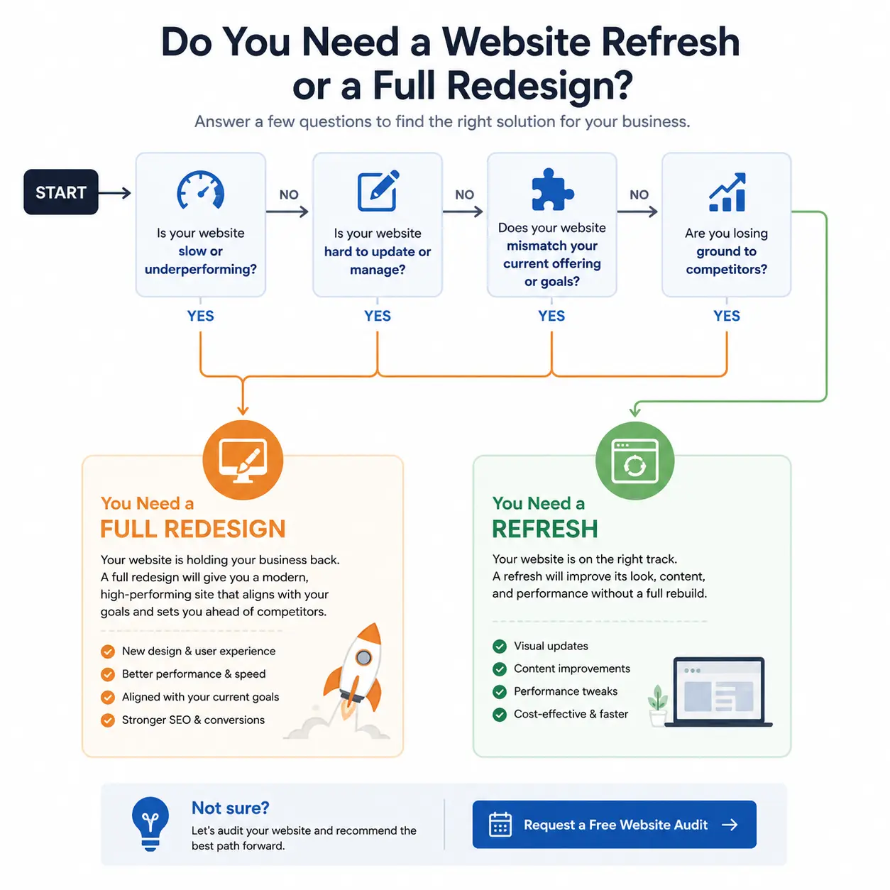
Website Refresh vs Website Redesign
Not every problem on this list requires tearing the site down and starting over. Understanding the difference between a refresh and a full redesign will save you from either overspending on a rebuild you didn’t need, or underspending on a patch that won’t hold.
A refresh is appropriate when the underlying structure, technology, and content strategy are sound, but the execution has aged — new photography, updated copy, a visual polish, maybe a new homepage layout. A redesign is appropriate when the problems are structural: the site is hard to update, doesn’t work properly on mobile, doesn’t reflect the current business, or was built on a platform that’s limiting rather than supporting growth.
| Website Refresh | Website Redesign | |
| What changes | Visuals, copy, imagery, minor layout updates | Structure, navigation, platform, content strategy, and design |
| Typical trigger | Site looks dated but performs fine functionally | Site has structural, usability, or technical problems |
| Underlying platform | Usually stays the same | Often changes or is significantly reconfigured |
| Timeframe | Weeks | Weeks to a few months, depending on scope |
| Risk to SEO if done well | Minimal | Manageable, with proper planning and redirects |
| Best for | Businesses whose offering and audience haven’t changed much | Businesses that have outgrown their current site or platform |
| Common mistake | Treating cosmetic changes as a fix for structural problems | Rebuilding everything when only specific sections needed work |
If you’re still unsure which category your site falls into after reading through the seven signs above, a straightforward gauge is this: if you found yourself nodding at three or more of them, especially signs 3, 4, 6, or 7, you’re likely looking at a redesign rather than a refresh. If it was mainly sign 1, and the rest felt like a stretch, a refresh may genuinely be enough.
Website Redesign Checklist
This checklist is meant to be used, not just read. Copy it, print it, or keep it open while you go through your own site section by section.
Before you start
- Pull your current analytics data (traffic, bounce rate, top landing pages, conversion points) as a baseline
- List every page on your current site and note which ones actually get traffic
- Identify which pages currently rank for meaningful search terms — these need careful handling during the rebuild
- Write down what the business does today, including services or areas that may have been added after the current site launched
- Set a clear goal for the redesign: more enquiries, better mobile experience, easier updates, stronger rankings — ideally more than one, but ranked in priority
Content and structure
- Rewrite or update copy to reflect the current business, not the business as it was when the old site launched
- Map out a navigation structure with no more than 6–7 top-level items
- Make sure every key page has one clear, obvious next step for the visitor
- Remove or consolidate pages that no longer serve a purpose
- Plan 301 redirects for every URL that’s changing, so existing rankings and backlinks aren’t lost
Design and usability
- Design mobile-first, then adapt up to tablet and desktop, not the other way around
- Check tap target sizes and form usability on an actual phone, not just a resized browser window
- Make contact information (phone, email, booking link) visible without scrolling on every key page
- Use real photography or original graphics rather than generic stock imagery wherever possible
Technical
- Test page speed with PageSpeed Insights before and after launch, and address anything scoring “poor”
- Confirm the site meets accessibility basics — proper heading structure, alt text, sufficient color contrast, keyboard navigation
- Set up or confirm SSL, XML sitemap, and robots.txt are correctly configured
- Test all forms end-to-end, including what happens after submission
- Check that the site renders correctly across major browsers, not just the one your team uses
Launch and after
- Submit the updated sitemap to Google Search Central after launch
- Monitor rankings and traffic weekly for the first month after launch
- Check that all old URLs redirect correctly and nothing returns a 404
- Schedule a review of site performance and content accuracy at least once a year going forward
Common Website Redesign Mistakes
Most of the redesign disasters we’ve seen during website reviews weren’t caused by bad design. They were caused by decisions made before the design work even started.
Ignoring Existing SEO
The most common one is redesigning without a plan for existing rankings. A business decides to move to a new platform, changes every URL in the process, and doesn’t set up redirects. Overnight, pages that took years to earn their position in search results return a 404, and both the rankings and the backlinks pointing to them are gone. This is entirely avoidable with a proper migration plan, and it’s one of the few redesign mistakes that’s genuinely hard to undo once it happens.
Designing for Yourself Instead of Customers
Another common mistake is designing for the business owner’s taste instead of the customer’s decision-making process. It’s natural to want a site that feels impressive to look at. But a homepage built to impress the person signing off on it, rather than to guide a stranger toward a decision, often ends up beautiful and unproductive at the same time.
Removing Valuable Content
A third mistake is losing content that was actually working. Not every page on an old site is dead weight. Some blog posts or service pages, despite looking dated, are quietly bringing in consistent traffic and enquiries. Wiping the slate clean without checking what’s currently performing is how businesses accidentally throw away years of earned search visibility.
Skipping Mobile Testing
A fourth mistake, more operational than strategic, is skipping mobile testing on a real device before launch. Plenty of redesigns look flawless on the designer’s laptop and fall apart on an actual phone — buttons too small, forms that don’t trigger the right keyboard, images that take forever to load on a mobile connection.
Treating Launch Day as the Finish Line
And a fifth, worth naming honestly: treating the redesign as a one-time event rather than the start of an ongoing process. A new site launched today and never touched again will be back on this exact list of warning signs in another few years. The businesses that get the most value from a redesign are the ones that keep reviewing and adjusting the site afterward, rather than considering the project “done” the day it goes live.
Best Practices
A handful of principles come up again and again in the redesigns that actually move the needle for a business, as opposed to the ones that just look nicer without changing outcomes.
Start from the customer’s question, not the company’s org chart. Many outdated sites are structured around how the business sees itself internally — departments, service categories, internal terminology — rather than how a visitor actually searches and thinks. Structuring the site around the questions and decisions a visitor is working through tends to outperform structuring it around how the business is organized.
Treat speed as a design requirement, not an afterthought. It’s tempting to add every visual flourish available and deal with performance later. In practice, load speed directly affects both user behavior and search visibility, so it needs to be a constraint the design works within from the start, not a problem to fix after launch.
Design the conversion path before the visuals. Before choosing colors or fonts, it’s worth mapping out exactly what you want a visitor to do on each page and how many steps stand between “interested” and “converted.” A beautifully designed page with a confusing or buried conversion path will still underperform a plainer page with a clear one.
Keep the content management system realistic for who will actually use it. The most elegant platform in the world doesn’t help if the person responsible for updates finds it intimidating and avoids using it. Match the platform to the team’s actual comfort level and workflow, not to what looks impressive in a proposal.
Plan for what happens after launch. A redesign should include a plan for ongoing content updates, technical monitoring, and periodic review — not just the initial build. This is where redesigns tend to blur into ongoing efforts like SEO Services or CRM Automation, because a site that captures leads well only pays off if there’s a system behind it to follow up on them properly.
Frequently Asked Questions
How do I know if my website needs a redesign or just a refresh? If the core structure, technology, and content strategy are sound but the visuals feel dated, a refresh is usually enough. If the site is hard to update, doesn’t work well on mobile, or no longer reflects what the business actually offers, that points to a redesign.
How often should a business redesign its website? There’s no fixed timeline that applies to every business, but most sites start showing real signs of age within three to five years, especially if the business itself has grown or changed during that period. A better approach than a fixed schedule is an annual review to check whether the signs in this article are starting to appear.
Will a redesign hurt my SEO rankings? Not if it’s planned properly. The risk comes from unplanned changes — new URLs without redirects, removed content that was ranking, or a slower site after launch. A redesign that accounts for these factors from the start typically maintains or improves rankings rather than harming them.
How long does a website redesign typically take? This depends heavily on the size and complexity of the site, but most small to mid-sized business redesigns take anywhere from a few weeks to a few months, factoring in content updates, design, development, and testing.
What’s the difference between a website redesign and rebranding? Rebranding involves changing the visual identity of the business itself — logo, colors, messaging — and often triggers a redesign as a result. A redesign, on the other hand, can happen with or without a rebrand; you can rebuild a site’s structure and usability while keeping the existing brand identity intact.
Can I redesign only part of my website? Yes, and in some cases this is the right call. If most of the site is performing well and only specific sections — a particular service page, the homepage, or the mobile experience — are causing problems, a partial redesign focused on those areas can be more efficient than a full rebuild.
How much should a website redesign cost? Costs vary widely based on the number of pages, the complexity of functionality needed, whether custom design work is involved, and what platform the site is built on. Rather than anchoring to a number, it’s more useful to scope the project against your specific goals and get a detailed proposal based on your actual site, which is part of what a proper website audit is for.
Do I need a redesign if my website is only two years old? Age alone isn’t the deciding factor. A two-year-old site can already be outdated if the business has changed significantly, if it was poorly built to begin with, or if it’s failing on mobile usability or speed. Conversely, a well-built five-year-old site with strong fundamentals might only need a refresh.
What should I do first: redesign or run a website audit? An audit first, in almost every case. A proper audit identifies exactly which of the signs in this article apply to your specific site, which prevents both overbuilding (redesigning parts that were already working) and underbuilding (missing structural issues that a fresh coat of paint won’t fix).
Conclusion
If you’ve made it this far and found yourself nodding along to three or more of the seven signs, that’s not a coincidence and it’s not really a design problem. It’s a signal that Your website has fallen behind the business it’s supposed to represent — and every month that gap stays open, it’s costing enquiries, ad spend efficiency, and a bit of credibility that’s hard to quantify but easy to feel as a visitor.
None of this requires a dramatic decision made today. It requires an honest look at what’s actually happening on the site, measured against what the business needs it to do. If you’re unsure which direction makes sense, start with a free website audit before committing to any redesign project.. Sometimes it leads to a smaller, more targeted fix. Either way, the starting point is the same: understand exactly where the site is falling short before deciding what to change.
Free Website Audit
Still have questions? Get in touch and we’ll be happy to discuss your website and whether a redesign is the right next step., we offer a free website audit that looks at exactly the areas covered in this article — page speed, mobile usability, content accuracy, conversion paths, and technical SEO health — and tells you plainly whether you’re looking at a redesign, a refresh, or something more specific like a fix to your Website Development foundation, your CRM Automation setup, or how well your site is set up to support WhatsApp Automation and AI Automation for lead follow-up. No pressure, no generic sales pitch — just a clear picture of where things stand.
Sources referenced:
- Google Search Central — Understanding Core Web Vitals and Google Search results
- web.dev — How the Core Web Vitals metrics thresholds were defined
- Google Search Central — Mobile-first indexing
- Google Search Central — Site moves and migrations
- Google PageSpeed Insights — pagespeed.web.dev
- MDN Web Docs — Web accessibility basics